What the strongest visuals should communicate at a glance
- The second candle is often associated with peace, so the image should feel quieter than the first Sunday and less festive than the third.
- A clear Advent wreath, evergreen texture, and visible candle count make the scene immediately readable.
- John the Baptist, the desert, and the call to prepare the way are the biblical cues that give the day its depth.
- Purple or violet usually fits best in U.S. churches, while rose is generally reserved for later in the season.
- The wreath itself carries a European devotional history, especially from German and Scandinavian household practice.
What people usually want from second Sunday images
When I look at this topic, I assume the reader is not hunting for art for art’s sake. They usually want something usable: a header image for a church website, a social post for the week, a slide for Mass or worship, or a visual for an article on the liturgical year. That is why the best image is the one that communicates the Sunday quickly, even before anyone reads the caption.
In practical terms, that means the image should answer three questions at once: what Sunday is this, what season is it, and what mood should the viewer feel? In 2026, that matters because the second Sunday of Advent falls on December 6 in the U.S., which means churches and editors often need the visual ready well in advance. I would not choose a picture that only works as a generic holiday decoration; it should still make sense if someone sees it a week earlier or later.
The most useful images are usually the ones that can work in several places without losing their meaning: a bulletin cover, a newsletter banner, a sermon slide, or a devotional article. That practical flexibility is the real test, and it leads straight into the symbols that carry the season.
The symbols that make the image feel liturgical
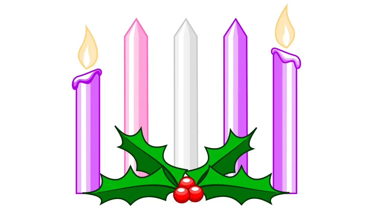
The strongest second-Sunday imagery is built from a small set of symbols rather than a crowded scene. I usually look for light, evergreen, a calm palette, and one unmistakable Advent cue. The wreath began as a German and Scandinavian home devotional practice, so even a simple setup carries a lot of European religious memory. That is useful for a heritage-focused site because it keeps the image rooted in tradition rather than in generic winter décor.
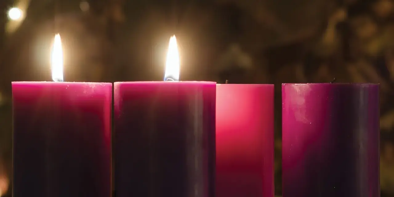
United Methodist materials explicitly call the second candle the candle of Peace, which is a helpful guide when you are deciding what the viewer should feel. The Church of England also notes that Advent wreaths are usually green with purple candles, sometimes with a rose candle later in the season. That is why a good second-Sunday image normally keeps the rose tone out of the frame and lets the second flame do the work.
| Symbol | What it signals | Best use | Common mistake |
|---|---|---|---|
| Evergreen wreath | Life, continuity, waiting | Bulletins, websites, classroom visuals | Turning it into Christmas décor too early |
| Second lit candle | Peace and the second week of Advent | Weekly devotional graphics, captions, slides | Showing three or four candles instead of two |
| Purple or violet cloth | Preparation, restraint, expectancy | Traditional parish imagery | Using bright red or metallic holiday tones |
| Desert or path imagery | John the Baptist’s call to prepare | Article headers, educational pieces | Making it look like a nativity scene |
| Soft light against darkness | The season’s movement toward hope | Homepage hero images, meditation pages | Overexposing the frame so the candle loses meaning |
That balance matters because second-Sunday imagery is never just decorative; it is a visual theology of waiting. Once the symbols are right, the gospel reading sharpens the picture.
Why the gospel readings matter as much as the wreath
The second Sunday of Advent is not only about the candle. In the lectionary, John the Baptist stands at the center, calling people to prepare the way of the Lord. That shifts the visual language away from pure warmth and toward repentance, clearing space, and movement. A strong image should be able to carry both notes at once: the peace of the candle and the urgency of the message.
That is where many images go wrong. They borrow the mood of the first Sunday, or they slide too quickly into Christmas imagery, and the result feels blurred. I prefer scenes that include a road, a desert horizon, a riverbank, or a figure pointing forward. Those details make the biblical reading visible without turning the image into an illustrated sermon.
| Sunday | Main tone | Visual cues that fit | What to avoid |
|---|---|---|---|
| First Sunday | Watchfulness and hope | One candle, darkness, a simple wreath | Christmas trees, nativity scenes, bright celebration colors |
| Second Sunday | Peace and preparation | Two candles, calm light, desert or path imagery | Rose candle imagery, festive sparkle, crowded compositions |
| Third Sunday | Joy | Rose candle, brighter palette, more visible light | Keeping the scene too severe or penitential |
| Fourth Sunday | Love and nearness | Mary, Joseph, manger hints, warmer light | Overloading the image with Christmas details before the season turns |
That difference is subtle, but it is the reason a liturgical image feels correct rather than merely seasonal. Once the Sunday is placed properly in the sequence, the next choice is style.
Which image style works best for a parish, classroom, or article
Not every setting needs the same visual language. If I am choosing imagery for a parish website, I usually want clarity and a real candle or wreath. If I am working for a heritage article, I lean toward something that feels more historical or interpretive, such as an icon-like illustration, a manuscript-inspired design, or a photograph with strong symbolic restraint. The goal is not to impress with effects; it is to make the liturgical meaning readable.
Here is the simplest way to think about it: photographs feel immediate, illustrations feel reflective, and minimalist graphics feel flexible. A photograph of a real wreath can be excellent for a congregation because it looks familiar and grounded. An illustrated desert scene can work better when the reader needs theological context. Minimal graphics are useful when the image has to hold text, especially on social media or a banner.
| Style | Strength | Best context | Limitation |
|---|---|---|---|
| Photograph | Feels real and devotional | Parish pages, bulletins, announcements | Can look cluttered if the background is busy |
| Illustration | Offers interpretation and symbolism | Articles, teaching materials, heritage pieces | Can become too stylized if the symbols are vague |
| Minimal graphic | Leaves space for copy and headlines | Social posts, headers, event promos | Can drift into generic holiday design |
| Historic or manuscript-inspired art | Connects well to liturgical history | Editorial and cultural analysis | May feel remote if the audience wants a simple worship image |
My rule is straightforward: if the audience needs devotion, choose familiarity; if the audience needs understanding, choose symbolism. The last step is making sure the image stays accurate in practice.
How to choose an image without getting the liturgy wrong
Accuracy is the part that saves an image from looking amateur. The most common problems are small, but they are easy to spot: the wrong candle count, the wrong color, or too much Christmas ornamentation too early. For a U.S. congregation in 2026, I would be especially careful with the date, because the second Sunday falls on December 6 and the visual should still look fully Advent, not halfway to Christmas.
If I were briefing a designer, I would ask for five things: the candle count should be obvious, the palette should stay purple or muted blue depending on the tradition, the composition should leave room for text, the image should hint at peace or preparation rather than full celebration, and the file should be clear enough to read at thumbnail size. That last point matters more than people think, because most readers see these images on phones first.
- Show two candles clearly, not one and a half, not three.
- Keep rose tones for later in Advent unless a specific tradition requires otherwise.
- Avoid nativity figures unless the image is intentionally moving toward the fourth Sunday or Christmas.
- Leave negative space if the image needs a title, caption, or verse reference.
- Use an image that still makes sense when cropped for mobile screens.
Once those basics are in place, the image can do more than decorate. It can actually guide the viewer into the rhythm of the season.
Why these images still matter beyond one Sunday
The deeper value of second Sunday imagery is that it shows how the liturgical year teaches through repetition. A wreath, a candle, a path in the desert, and a restrained palette may look simple, but they carry centuries of devotional habit beneath them. That is one reason these images fit so well on a site focused on European religious history: they are small visual forms with a long memory.
For me, the best image is the one that feels disciplined and alive at the same time. It should not look like generic winter art, and it should not try to explain everything at once. If it gives the viewer one clear idea - peace in the midst of waiting - it has already done its job. The strongest Advent visuals always leave enough darkness for the light to mean something.